- Academics
- Admissions & Enrollment Services
- Research
- Academic & Creative Spaces
- Strategic Partnerships
- Our Impact
- Student Affairs
- Campus & Community
In this interview, Huda Smitshuijzen AbiFarès talks about the concept and relevance of the ‘Inner Structures – Outer Rhythms: Contemporary Arab & Persian Graphic Design’ exhibition, the inspiration behind writing one of the first textbooks for Arabic type to be used in academia, and the setting up of the Khatt Foundation in Amsterdam.
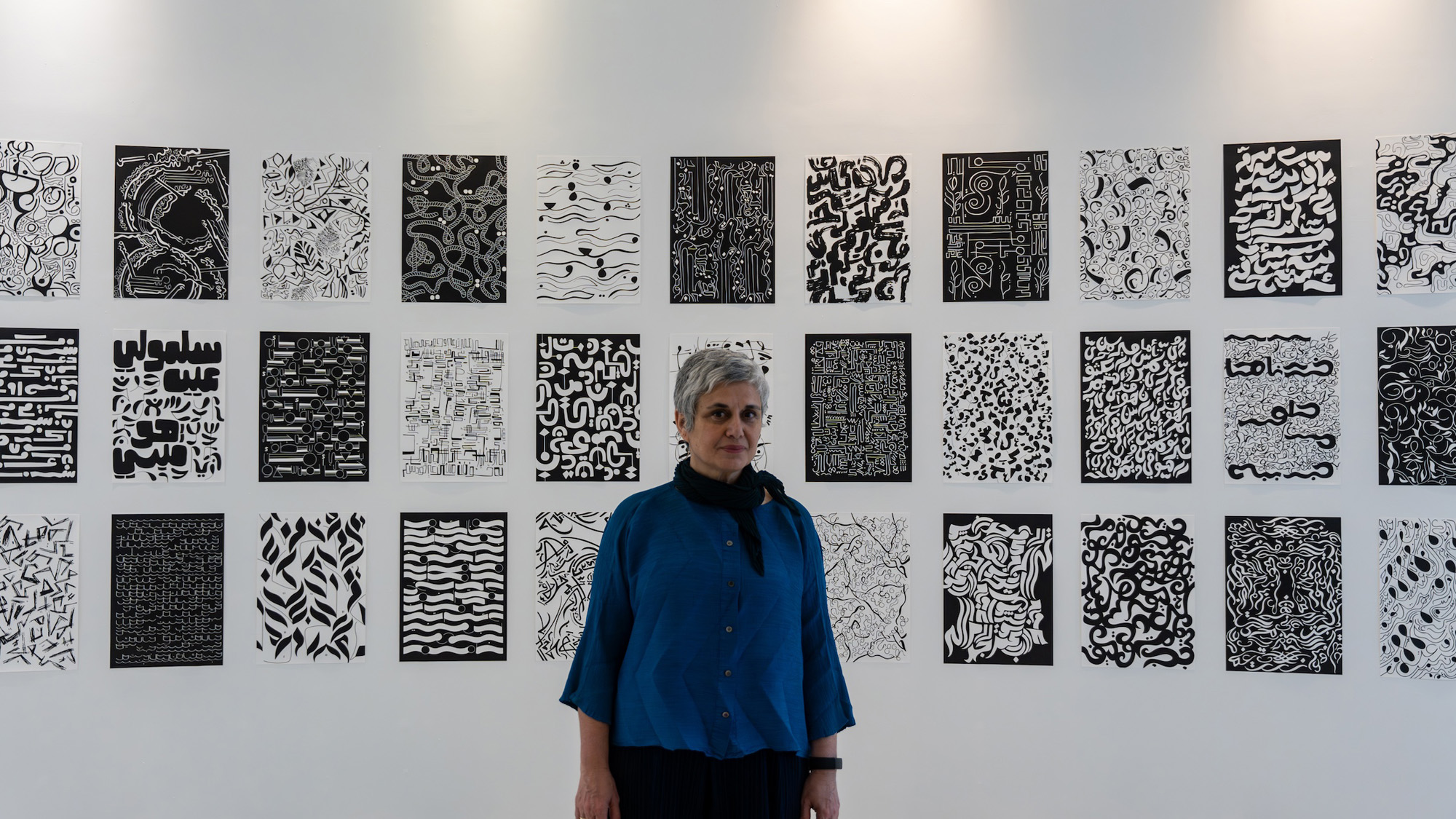
In conversation with renowned Arabic type researcher and curator of ‘Inner Structures – Outer Rhythms’ at VCUarts Qatar, Huda Smitshuijzen AbiFarès, Ph.D
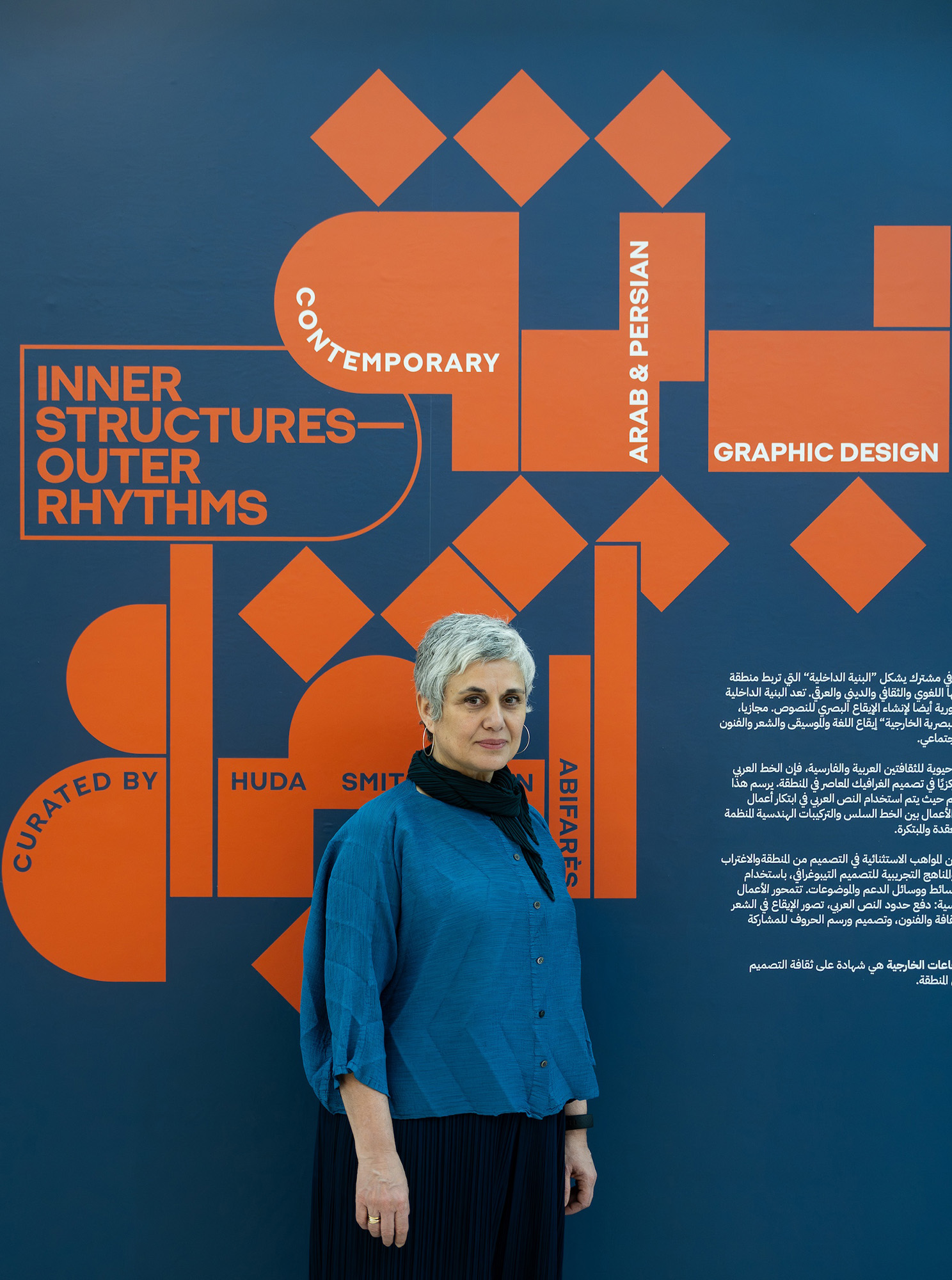
VCUarts Qatar is currently hosting ‘Inner Structures – Outer Rhythms: Contemporary Arab & Persian Graphic Design’ at its campus. The exhibition runs in parallel with the University’s international art and design biennial Tasmeem Doha 2024: Under Construction.
‘Inner Structures – Outer Rhythms’ showcases the power of Arabic graphic design and typography in communicating social change, local cultural concerns, and universal human and environmental challenges.
Curating works by more than 30 designers from the culturally diverse, creatively rich, yet often misunderstood, Southwest Asia and North Africa (SWANA) region is, however, no mean feat. And no one is probably better suited for the task than Huda Smitshuijzen AbiFarès, Ph.D., a Lebanese-Dutch typographer, writer, researcher, graphic designer, and curator. She is, after all, used to forging pathways where none existed.
In this interview, she talks about the concept and relevance of the exhibition, the inspiration behind writing one of the first textbooks for Arabic type to be used in academia, and the setting up of the Khatt Foundation in Amsterdam.
Let’s start with the concept of the exhibition. Our audiences and readers are keen to know more about it.
One needs to understand the historical context of Arabic type to understand the concept of the exhibition. Since the nineteenth century and post-colonial era, the region was sectioned into smaller geographical areas that became the modern countries we know today. Though separated by new national borders, the Arabic script remained a binding agent across this ethnically, linguistically and religiously diverse region. Through these mergers and splits the art of calligraphy not only prevailed but flourished. Early artists, whom we refer to as calligraphy masters, from different regions left their inventive styles and aesthetic stamps on the script. They continue to inspire generations of artists and designers.
In the title, ‘Inner Structures’ refer to the hidden systems or mechanisms that support distinct components and integrate them into a meaningful whole. In the case of this exhibition, hidden ‘inner structures’ in Arabic typographic and graphic compositions are conveyed to the viewer through visual ‘Outer Rhythms’. These ‘outer rhythms’ are the ideas that spread and ripple across society, moving us to action or tears, often transporting us to higher levels of understanding and inspiration. These ‘rhythms’ can also be interpreted as the tempo of sound (for instance, in music and poetry), that is outwardly visualized through the movement of graphic elements, letters, shapes, textures and colors.
To join the dots: In this exhibition, we see how ‘inner structures’ in graphic design born from Arab and Persian influences have created – and continue to create – the ‘outer rhythms’ one finds across Arabic script and all its regional derivatives today. The works on display were selected to reflect these various explorations and approaches; they are the finest examples of Arabic type design in the region.
How important is it for exhibitions such as these to be held in universities and not just in public museums or galleries in the wider community?
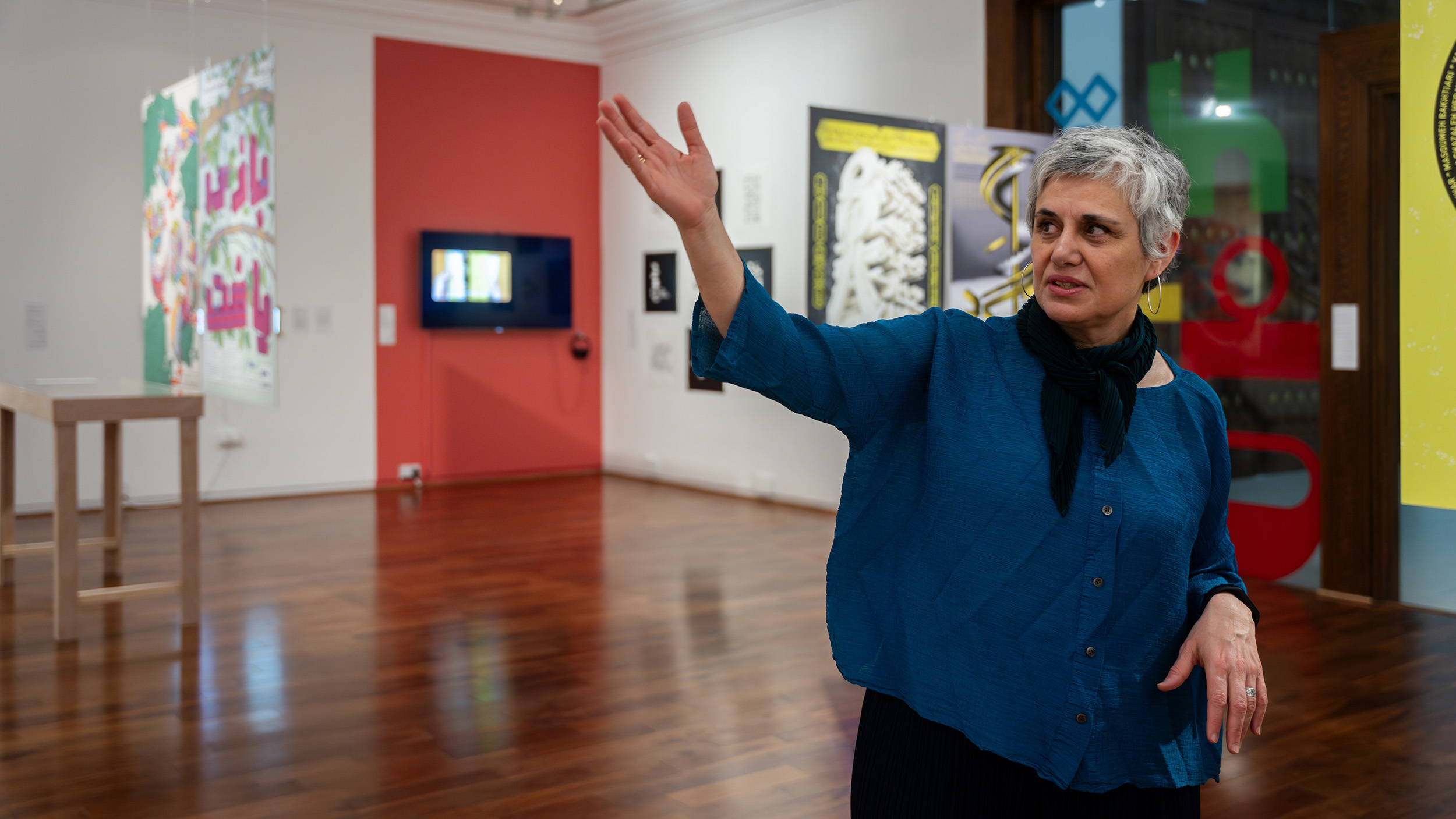
There is no doubt exhibitions such as these complement education. Design students see and learn from them. I know of instances where this exhibition has become a starting point for students to research designs from the Middle East. This is remarkable, especially if those students, until then, were never introduced to typography from the Arab-speaking world.
Another aspect is that though graphic design is all around you, exhibitions on graphic design are not as common and do not get as much exposure as, say, fashion design or architecture. Hence, it’s important that it visits universities that focus on art and design.
Of course, VCUarts Qatar is in the Middle East, and no doubt students here are familiar with a few Arabic-type designers, but it is not every day that they can visit an exhibition that displays works by well-known, emerging and experimental designers – all under one roof. This is an excellent chance to study the evolution of modern Arabic type and discuss the possibilities it holds.
This is a traveling exhibition. It was on display in the US, before coming to Qatar. The next stop is Germany. Different audiences mean different interpretations, and hence different responses. Could you elaborate on that?
It is always exciting and interesting to see how audiences in different regions react. For instance, in art and design schools such as VCUarts Qatar, the focus is almost always on the design elements, and the factors that influenced those designs. Whereas, say in Germany or the US, the conversations are more about design and its power to change society, to inspire thought or to create momentum for a cause. The exhibition never fails to spark conversations that compare contemporary graphic design and the more traditional, classical or older designs in type. And it’s interesting to hear that.
Sometimes, visitors to the exhibition are surprised at just how contemporary Arabic type can be. Especially for audiences in the US or western Europe who have this stereotypical expectation that Arabic type is calligraphy. That’s what they’re exposed to, and it’s gratifying to observe their surprise when they discover some of the stunning modern fonts that Arabic-type designers have created.
And, as I mentioned before, irrespective of what part of the world you’re in, there is this wonder of discovering so many nuances of Arabic type in one space – in that context, this exhibition is almost like a traveling book of the past and future of Arabic type.
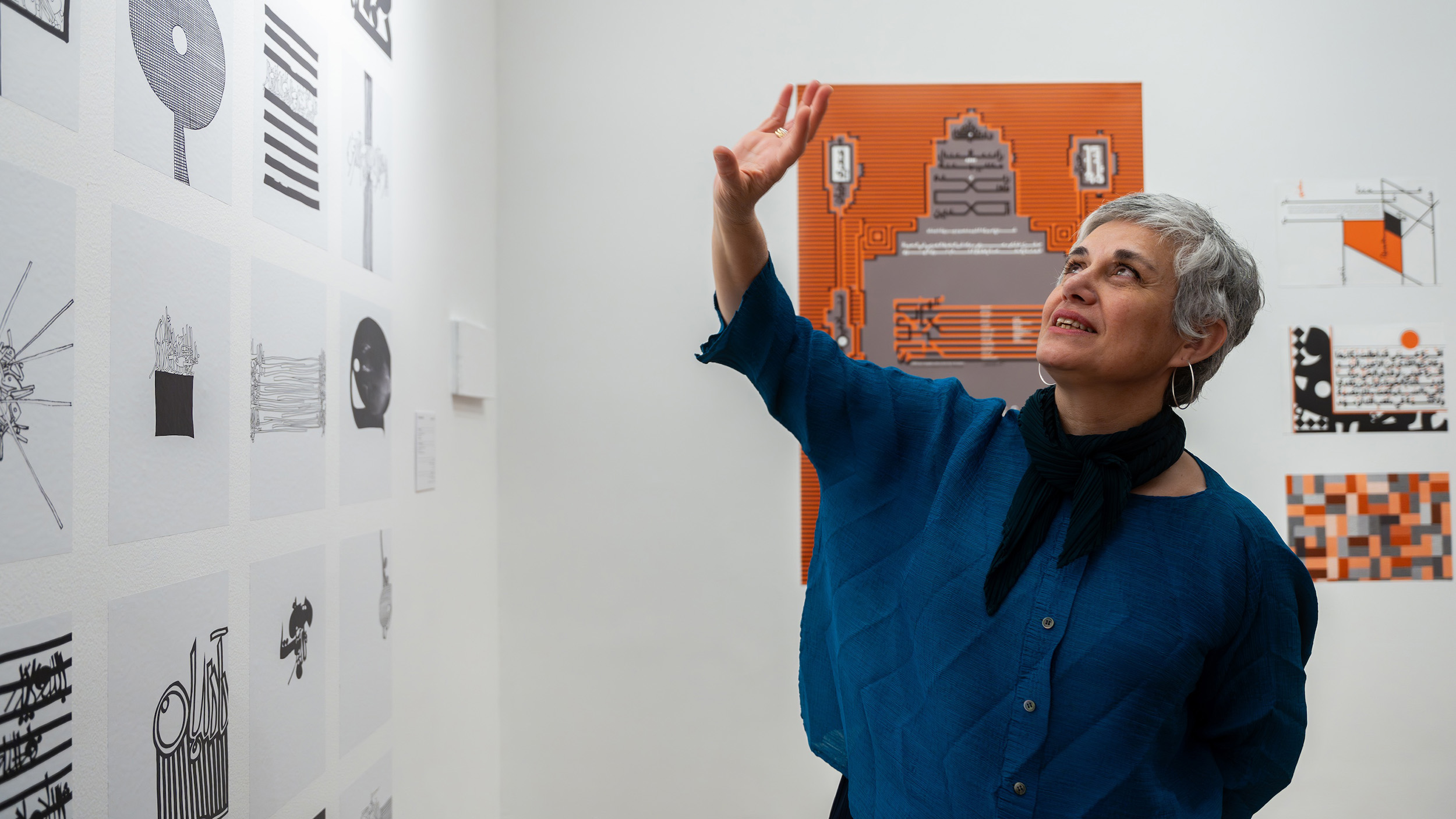
Some parts of the exhibition explore the future of type design through themes such as ‘Beyond Arabic Calligraphy’. Can you explain what that specific theme is about?
When you think of type, you think of the alphabet. Yet, as I pointed out, when it comes to Arabic, most people automatically think of calligraphy. But what if the alphabet becomes a form of graphic that tells a story or conveys a message by itself? For instance, instead of a letter that is written, imagine letters that are drawn using shapes, all of which tell a story. This can take the form of something that is not necessarily legible but can be interpreted as being a reaction to something.
An example would be looking at old manuscripts and then drawing them in a different way that is contemporary based on different proportions and different graphic forms. One could take Islamic geometry as a starting point and build these letter forms using specific geometry and grids.
So, it is this concept of going beyond the obvious forms of Arabic type, of experimenting with designs beyond current trends and practices that, is explored in themes such as ‘Beyond Arabic Calligraphy.”
The exhibition is taking place at a time when two events focusing on art, design and culture in the region – Qatar Museum’s Design Doha Biennale and VCUarts Qatar’s popular Tasmeem Doha conference – are taking place in Qatar. How do you see ‘Inner Structures – Outer Rhythms’ complement these?
The Middle East has been coming into its own in terms with the quality and themes explored by artists and designers. Doha is no exception. People here value design, and designers. Any visitor to the country can feel this. Resources for artists and designers, an atmosphere that encourages innovation, and platforms to showcase creative excellence – these are what creative minds look for. And they’re here.
The city has world-class museums, an art and design university in the form of VCUarts Qatar, flourishing public art and numerous events that bring the best of art, design and culture, to the public. People here are accustomed to exploring, they’re comfortable with experimenting, with change and with discussing possibilities. They’ve done this without sacrificing tradition or history. It’s a balance. Viewed through that lens, I would say there never has been a better time to organize this exhibition – with its emphasis on contemporary Arabic graphic design that is rooted in Arab and Islamic heritage – in Doha.